Why Apps Feel So Different in 2025
- Software
- November 26, 2025
- 548
Open your phone today and you’ll notice it fast: apps don’t just look newer, they feel different. Screens are cleaner, buttons are less obvious, and more things happen automatically in the background. This isn’t one single trend. It’s a bundle of design shifts that have been building for years and, by 2025, have finally become the default across mobile and desktop software.
Interfaces are becoming more “material” and alive
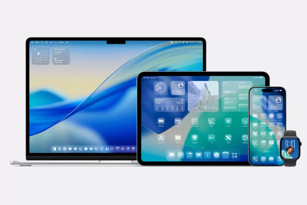
One of the biggest visual changes is the move toward interfaces that behave like physical materials instead of flat panels. Transparency, depth, and soft motion are everywhere. Apple’s latest system design refresh pushes this hard, and you can already see the ripple effects in apps like Safari, Photos, and FaceTime. Google’s Android ecosystem has been moving in a similar direction with layered surfaces and more responsive UI elements.
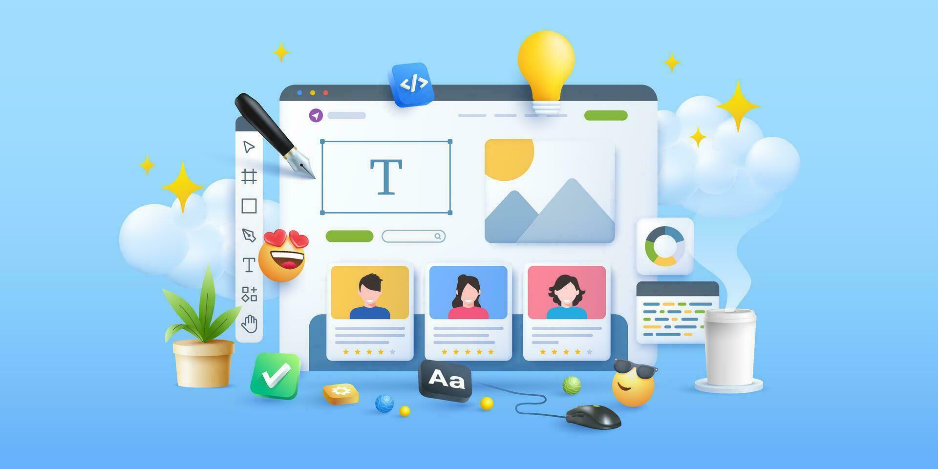
The idea is simple: apps should feel less like grids of buttons and more like spaces you move through. Done well, it makes navigation feel intuitive. Done badly, it can look pretty but reduce readability. Either way, it’s changing what “normal” app design looks like.
Gesture-first design is replacing visible controls
Apps are hiding more controls and expecting people to know the gestures. Swipes, long-presses, edge pulls, and contextual menus have become primary navigation tools, especially on mobile.
You can see this in mainstream apps like Instagram, TikTok, and Google Maps, where the interface stays minimal until you interact. Even productivity tools like Notion or Slack rely heavily on hidden menus and quick actions to keep screens uncluttered.
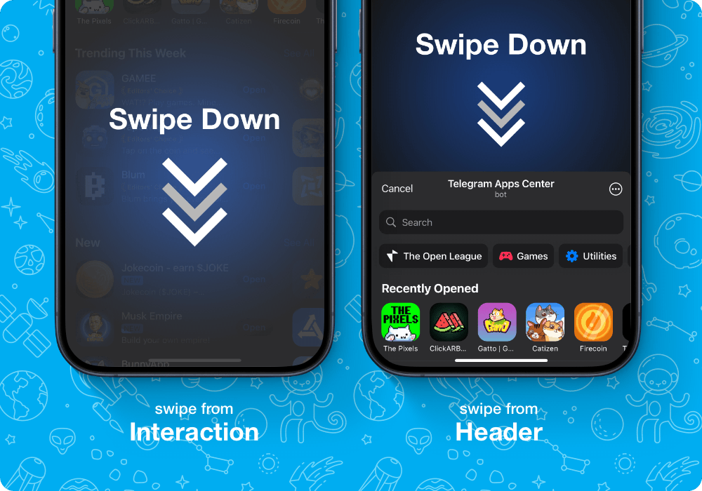
The upside is cleaner layouts. The downside is that some functions become harder to discover, especially for newer users.
Personalization is no longer a bonus feature
A typical app in 2025 adapts to you by default. Feeds reshape in real time, layouts suggest what you might want next, and the app often feels like a different product depending on who’s using it.
Spotify’s home screen, YouTube’s recommendations, and Duolingo’s lesson paths are obvious examples, but this pattern has spread beyond content apps. Shopping, travel, finance, and even calendar tools now personalize “first screen” experiences instead of showing everyone the same starting point.
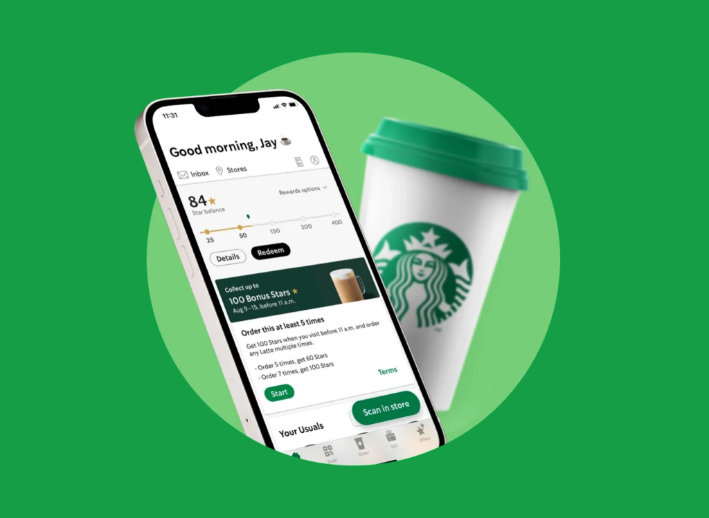
It makes apps feel smarter and more relevant, but it also raises questions about control. Many users don’t realize how much of their interface is algorithmically decided.
Voice and audio layers are quietly expanding
Voice control isn’t new, but in 2025 it’s more integrated and less awkward. Instead of being a separate mode, voice is often built into normal workflows. You can dictate a message in WhatsApp, search a playlist hands-free in Spotify, or ask a smart assistant to set reminders without opening a specific app.
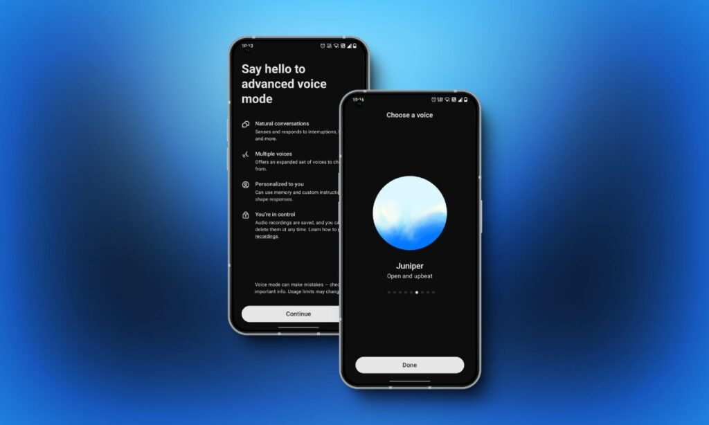
Audio feedback is also creeping back in subtle ways: soft cues for confirmations, live captions, or voice summaries. For many apps, especially on wearables and in cars, voice is becoming a second interface, not a novelty.
Apps are designed to work across more screens
People switch screens constantly: phone to laptop to tablet to car display. Apps are responding by becoming more fluid across devices. You don’t just get a resized interface, you get a rethought one.
Microsoft Teams, Google Workspace apps, and Adobe’s cloud tools are built around this idea. Even entertainment platforms like Netflix and Spotify aim for near-identical continuity across devices, so you can pick up where you left off without friction.
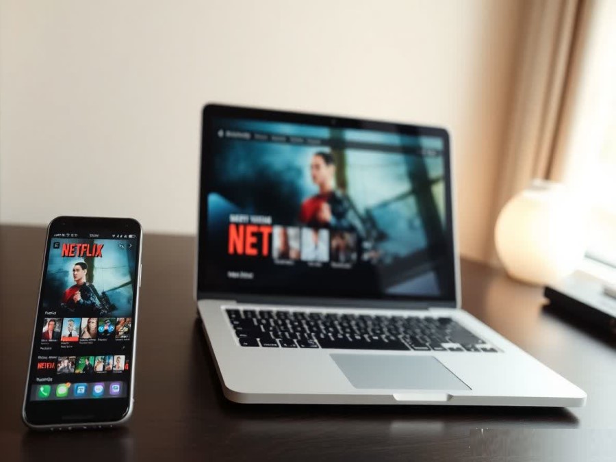
Designers are now thinking in ecosystems instead of single screens, and that changes everything from layout to interaction patterns.
Privacy and trust are shaping the interface itself
The past few years of platform-level privacy rules have pushed apps to surface control more clearly. You now see more permission prompts, clearer location toggles, and explicit data-sharing options.
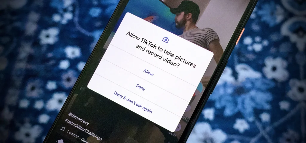
Apps like iOS Mail, Chrome, and Meta’s platforms increasingly signal what’s happening under the hood. You may get alerts about tracking, file access, or camera usage. Sometimes it’s helpful. Sometimes it’s noise. But it’s a real UI shift: trust cues are now part of design, not just policy.
What this means for users
Apps feel different in 2025 because design is moving toward experiences that are more dynamic, more personalized, and more hidden in plain sight. Interfaces are less about buttons and more about flow. Less about one-size-fits-all screens and more about adaptive systems.
For most people, the change is subtle but cumulative. The everyday result is that apps can feel smoother and more helpful — but also more mysterious. The new rules of interface design are built around speed, simplicity, and context, even when that means giving up a bit of visibility.
Expect this direction to continue: fewer obvious controls, more responsive UI, and more apps that reshape themselves around how you live, not how software used to be organized.